

This is really cool. I install extensions to remove the Activities button and display a workspace indicator.
A lot of Workspaces might present a problem though. Currently, the Workspace indicator extension with collapse into a number after 8, or so, and I’m not sure how that scenario would work with the proposal.
Btw, they released it as an extension.
It seems more and more that the GNOME extension ecosystem is going to make it more customizable than Plasma one day
From my experience so far it’s more like installing gnome extensions just to get a fraction of the customization of stock kde, and I don’t really see that changing any time soon.
thank
Well, I’m trying it out and I gotta say… I just don’t care.
I mean, it looks nice, and I guess the extra info is good. On the other hand, I weirdly miss the word in the corner. On the other, other hand, it’s such a small change I can’t imagine getting upset about it if it became the default.
So… Yeah. Whatever’s clever, Gnome team. I’m happy either way.
I’m using it now and I feel the same way. It makes more sense to have a workspace indicator but I’m so used to the activities text at the top left that it just feels weird. I don’t care if they change it it’s just weird not having it after seeing it for 6 years
On the other, other hand, it’s such a small change I can’t imagine getting upset about it if it became the default.
Haha, more folks should have this attitude.
I agree. I saw someone said something along the lines of “kill it with fire” an all I could thing was that sounds like a lot of effort for a couple dots in a corner.
Configurability is the answer. Some people like it some don’t, just have a setting to turn it off and it’s fine
Personally I don’t see much point in it as I just use the three finger swipe anyway, too much effort to mouse up to the top left and click it then navigate a GUI compared to just swiping left and right
I like it. Def more useful
Been using the PoC extension for a few days now and I’m absolutely in love with it <3
Good! I don’t get much use out of the button (or hot corner tbh) on a laptop. Gestures are king
That seems l like a fine addition, although visually an explicit number being shown would be enough and even better imho.
What das it do?
Read the article?
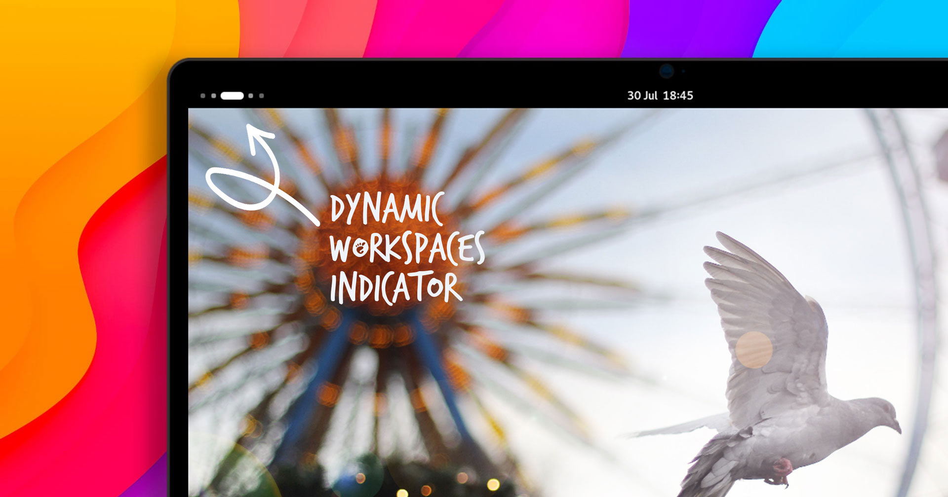
Basically, it replaces the word “Activities” with dots representing your workspaces, with the one you’re on being a pill-shape. So if you had three active workspaces and you were looking at the third one it’d be kinda like this:
O O (__)
It doesn’t affect the button itself at all, just changes the visual.
Literally never use the activities button. Happy to see it go.
Still a piece of garbage. Can’t they simply admit they were wrong and add a permanent panel with icons (like Windows or Mac) at the bottom of the screen and move on?
Eh, I used to think this way until I actually tried GNOME for a bit. I’ve grown quite fond of its workflow. There’s definitely extensions that I feel I need for it to be fully usable from my perspective, but in some ways I see it as a positive to start out with a good foundation and then allow users to extend the functionality they feel they need onto that base. Not every user is going to want the same thing, so keeping the core minimalist makes sense.
If I wanted something like Windows, I’d use KDE. If I really wanted a GNOME Windows-like experience similar to the old GNOME2 behavior I’d use something like MATE or Cinnamon. I guess my point is that there’s plenty of DEs out there that are essentially copies of the same workflow. I respect the desire to innovate in GNOME3.
I’m guessing everyone who likes GNOME (me included) only uses it because of its unique workflow. And that’s exactly why people were hesitant by GNOME 3 (besides the UI. I’m not a linux user from that time but damn the UI was weird seeing some old screenshots)
@MarcellusDrum@lemmy.ml
is it that unique?
For me it just strikes a nice balance between a full tiler and a classic desktop UI.
And in my book, you don’t even need any extensions, the core product is fine as it is.
I can’t agree as I love Gnome and now feel lost when I have to use windows or MacOs. The way it uses the workspace and the way your screen isn’t cluttered with informations is great for someone like me.
And extensions are there to help you with almost every limitation you encounter.
You don’t like your LEDs blinking Morse code of your 1s average combined CPU load?
Again, extensions aren’t as polished as built in stuff. A prime example of this was when they ditched desktop icons, the extensions that followed fail sometimes.
Or just you can use a different de and move on?
Use the dash to dock extension
I’m using that and ArcMenu…
Dash to panel/dock + Arc Menu? ;)
I know it’s contentious but for laptops and limited size displays I love the GNOME layout over KDE. Gestures are also way better, even on X11.
It does everything MacOS was trying to do, but executes it way better. I say this as someone who uses MacOS daily for work.
It has some pain points but there’s a reason it’s such a large part of the Linux ecosystem
I wish that’s all they were wrong about…
You will do it the way they saw in that fever dream, for such is the way of Gnome.